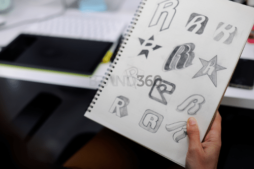
8 Useful Tips to Jazz Up Your Brand Logo Design

Let’s be truthful here. There is no secret recipe or codes or hacks or tricks to a successful logo design. Brand logos are as successful as the brand and the product experience that it provides. However, a brand logo is the face of a company, so it’s only logical to put substantial resources and thought into developing one.
A brand logo is an essential part of a brand’s identity. You would want a logo that can be used on multiple platforms (especially online), recognisable enough to stand out and most importantly, complement your values and personality as a brand. There are a few tips on creating a logo that can work for you, based on design and marketing principles.
- Keep it simple yet flexible
We can only focus on peripheral stimulus for a few seconds. Peripheral refers to things we may or may not see while we focus on the main task, like shopping or driving. Think about your logo in action; whether it is on the shelves of supermarkets, billboards by the road or the bottom half of a page in a magazine. A logo that is too complex would not be recognisable nor memorable. You want a logo people can remember to establish brand recognition. A logo has to also be flexible enough that it can be used in grayscale, on various offline and online platforms and induce a recognisable pattern. - Be creative and unique
Simplicity is always key to a good brand logo, but to stand out and be recognisable, a logo can also be unique and witty. Google Doodles are a great example. To commemorate an event, person or a historic day, Google will appear as various doodles that cleverly capture the essence of the day. While doodling, Google still retains its logo by preserving their letters as creatively as they can, playing with patterns that people can perceive.
Google Doodle on Malaysian GE13

Google celebrates Malaysian Independence day

Google celebrates Dragon Boat Festival Picture Sources: Google.com
- Keep in mind your brand name
Many brands include their name in the overall brand logo design. The logo has two parts – an icon or symbol, and the brand name. Take care how the name is placed and portrayed, so that it complements the icon and yet can stand on its own, if the situation calls for it.
Picture source: corporationprofile.wordpress.com
Petronas logo and wordmark, combining to form the brand’s combination mark. In cases where the Petronas brand is already established and well-known, only the symbol is used with the wordmark excluded.
- Choose the right colours
More often than you might think, the colours of your brand logo play a big role in your brand identity. As colours are closely associated with emotions, choose colours that fit well with your brand’s value, personality and target customers.
Picture Source: amazon.com
To appeal to their male customers, Dove ditched their white background colour that is always used for female products and tweaked it to grey, while still maintaining their wordmark and the dove icon.
- Select the best font
Aside from colours, fonts act to communicate your brand identity as well. Whether it’s sans serif, script or modern, you can have the freedom and creativity to choose (or make your own) the font that best fits your logo. Different typefaces come off with different personality and tone of voice, and it is one of the quickest ways to send your brand message to your customers.
Picture Source: feedough.com
The heavy metal band Metallica has an iconic font depicting their genre and music style, first used in the 1980’s on their business cards. Once the logo got into their 1996 album, the rest was history.
- Avoid cliches
Following design trends is a norm. It’s easy, it’s familiar, people think it’s cool and trendy, and there’s a lot of examples (and templates) to get inspiration from. But the point of your brand logo is to symbolise you for who you are, not the year and generation your brand was born. Design trends can also get saturated, which means your brand can drown in the pool of overused design templates.
Picture source: pinterest.com
- Update once it gets outdated
Although your brand logo has no expiration date, there is a need for a change or update when the time comes. There are several signs when it is time for a logo change. It could be to adapt to changing media, to recharge the public, or to stay relevant in an increasingly competitive industry. Some changes are minute while some logos received a major makeover, depending on the needs of the company.
Picture Source: boredpanda.co
Canon’s first logo from 1934 would not be relevant today, since it would be hard for customers to associate the Guan Yin deity to anything related to cameras. Through the years it has gone through many radical and minute changes to become the Canon logo today.
- Know that lasting success takes time
It is very exciting to announce a new logo, but traction takes time especially if you want yours to last. Iconic logos like Nike and Adidas didn’t get much hype when they first graced sports equipment. American graphic designer Michael Bierut told us to think of logos as empty vessels where you pour meaning and values into it. The Nike swoosh was great because the brand made it great, using clever and effective branding strategy.
Picture Source: templatemonster.com
Since 1971, Nike used the Swoosh on their shoes and other products. It has a low-profile and humble beginning. Throughout the 80’s and 90’s (even today) however, Nike’s consistently successful marketing techniques made the Swoosh well-known and associated with Nike’s winning image.
Whether you’re starting a new company, launching a new product or refreshing a tired brand, a strong brand logo design is crucial. As the face of your company or product, remember to adhere to your brand at all times and heed the tips above for a timeless logo. If you need some help, a brand design agency will be able to guide you through the design process to develop the right brand logo design that balances visual appeal and practical use while staying true to your brand.


