
Mou Dak Ding!
Best Ang Pao Brand Designs of 2021 🧧
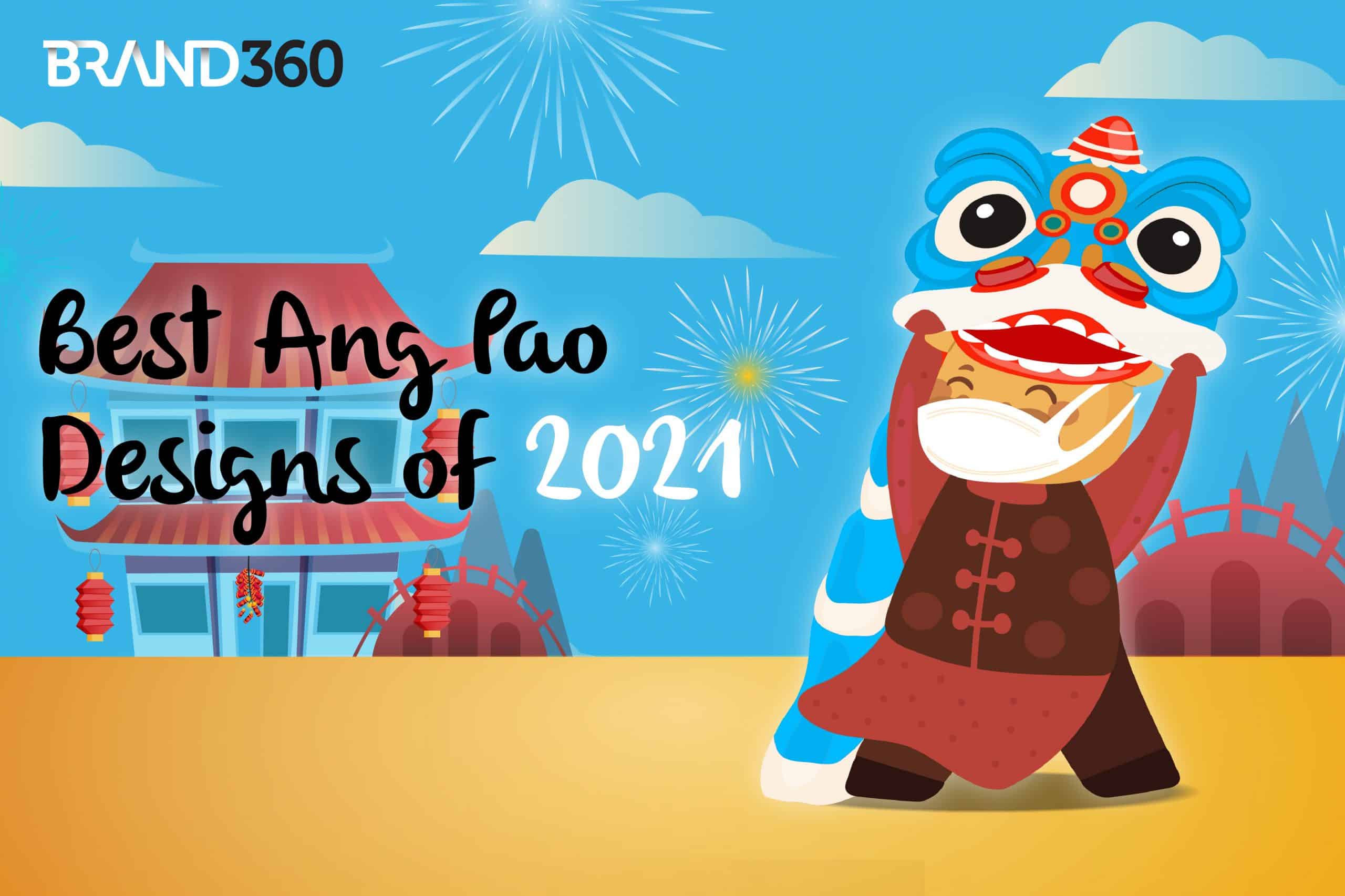
HENG ah! ONG ah! HUAT ah!! 🧨
If you’re reading this, you’re probably a business owner in Malaysia. 🇲🇾
Did you know that ang paos can become a powerful branding tool (when used right)?
Just think about it. Over the years, many brands have turned the tradition of ang paos into a serious design competition. ⚔️
This isn’t surprising! Every Chinese New Year, ang pao collectors are always rushing to collect the next-best ang pao packet. 🏃♂️💨
So, no wonder many business owners are using ang paos to increase their brand awareness!
As a business owner (and ang pao fanatics ourselves), we’ve put together a collection of Malaysia’s best ang pao designs in 2021. 👍
In this article, we’ll pick apart some of the best brand design elements used in the ang paos below, and explain how brands use them to amplify their branding.
Best Ang Pao Brand Designs of 2021
To make things easier, we’ve categorised our ang pao packets into 4 types of design styles below: Traditional, Modern, Premium and Chinese Culture ang paos. 🧧 Let’s start with the first one.
Traditional Ang Pao – Brand Designs
Staying true to the traditional CNY design, these ang paos pride themselves in their simplistic and traditional red or yellow colour design, often printed with a golden word 福 (fú) on the front.
Don’t be fooled by its simplicity. The graphic designers for the following brands spend at least a week or more to produce these classic beauties! With that said, here are our top 3 brand designs for traditional ang paos, that we love!
- Credit Suisse

Credit Suisse got every design element right for a traditional ang pao! Everything from the smooth red packet paper, Chinese words, golden plated colours and most importantly, a vector image of an ox (2021’s zodiac animal).
Close your eyes and think about it for a second – Chances are, you wouldn’t mind giving it to them. It’s a beautiful ang pao, after all. Everything from the Chinese wordings, lanterns and the blooming flowers laced with gold signifies wealth, which matches Credit Suisse’s branding given that they are a global wealth and financial services firm.
From this, we can say Credit Suisse got its design correct, as its ang pao looks visually stunning to be given to relatives/friends.
- Public Bank Group

The beauty of Public Bank Group’s ang pao lies in its use of a variety of colours, whilst keeping certain visual elements of traditional Chinese designs such as the red peony flowers. The word 福 (fú) is also imprinted with gold colour to enhance the overall visuals of the ang pao.
Plus, if you look closely, you can see the material is also smooth, and doesn’t feel like normal paper at all when you touch it. All these design elements make this a wonderful ang pao that any family can use to give to their younger family members or friends.
The key here is this: although Public Bank Group designed something simple and traditional, they made sure that the ang pao is still something adults would give to young ones. (No one likes giving people something ugly – paisehhh la)
- Watsons

Watsons is an international health and beauty retailer in Asia and Europe with over 15,800 stores in 25 markets.
On their website, you’ll see their brand promise is to help customers ‘Look Good and Feel Great’, by providing them with the best personal health and beauty products.
This brand promise is reflected in the ang pao with the Chinese words saying: 活力好福气 (huó lì hǎo fú qì), which means: good health, greater blessing – emphasis placed on the word ‘health’ as it relates to Watsons’ business as a health and beauty retailer.
Aside from that, Watsons also paid good attention to their customer’s experience by printing a QR code on the back where their customers will get a surprise after scanning it. This is sure to get anyone excited!
And ta-da! Once you scanned the QR code, you’ll be directed to your Instagram Story where you can use Watson’s selfie filter (see our cute image!) to take an Ox-picious CNY picture with your friends!
For that we give two thumbs to Watson! They MAXIMISED their customer’s brand experience through the use of an ang pao.
Modern Ang Pao – Brand Designs
Modern and elegant. These red packets meld unconventional colours and unique designs into a work of art. What makes these packets so strikingly unique? The secret lies in one word: difference.
These creative red packets divert from traditional ang pao designs. It’s their difference that makes them stand out from the sea of other ang paos. Here are 3 of our favourite ones below!
- Accenture

To create a beautiful brand design, graphic designers use many elements such as colours, font styles and illustrations to make their design standout from the crowd. That’s what Accenture did for their ang pao.
More than that, Accenture brilliantly coloured its ang pao with the colour purple to match their logo’s colour (Note: Accenture’s logo has a purple coloured arrow symbol (>) on it).
This is a sign of good brand design, as Accenture’s branding team paid attention to their logo’s colour (purple), and applied it to the ang pao, which shows consistency in branding. Bottomline: Accenture reinforced their brand symbols by using both colour and brand element.
But that’s not all! Accenture also made their branding strikingly obvious by using the arrow symbol (>) in their logo to brand the entire front cover of their ang pao. Needless to say, these brand design elements will help Accenture in reinforcing brand recognition from their ang pao receivers.
- FedEx Express

Another brand that uses unique design elements in its ang pao to stand out from its competitors is, FedEx.
Here’s why: FedEx’s ang pao does not follow the traditional CNY red colour design, and the interconnected cubes and rectangular patterns on the ang pao gives it a special 3D effect. Moreover, if you look deeper into it, you’ll realise that these patterns on FedEx’s ang pao means something deeper.
From a designer’s perspective, these patterns symbolise FedEx’s brand vision that is: ‘Connecting People & Possibilities’, as seen on their website. Hence, the interconnection between the cubes and rectangular patterns on the ang pao.
As a finishing CNY touch, FedEx beautifully coloured 4 Chinese words on the ang pao, 步步高升 (bù bù gāo shēng) to give it a CNY feel. These words literally mean: step by step leads to success.
- Bonia

It’s almost a guarantee many young people will love this ang pao from Bonia! Most youngsters collect unique red packets like this over CNY, and are very careful not to tear them when opening it.
Bonia’s ang pao design is modern and unconventionally shaped like a bag which ladies carry around. At first glance, the shape and design helps Bonia with their brand recognition, as it’s easier for people to recognise that it’s from a luxury brand selling bags.
Moreover, the illustration of a woman’s bag as an ang pao is a wise choice! This is because it’s very consistent with Bonia’s overall branding – luxury bags, shoes and accessories.
It would be weird if Bonia designed their ang pao with a car on it since their brand doesn’t sell cars. Branding, even when it comes to ang paos, has to be relevant and consistent with the company’s products.
Premium-Quality Ang Pao – Brand Designs
For an ang pao to be seen as premium, the design must be seen as something of higher quality. It may look similar to traditional ang paos, but its quality is elevated, making it more classy and striking than the usual. Premium ang paos also often come in elegant boxes to highlight its exclusivity.
Most of all, the features of a premium ang pao must catch your eyes. It is the attention to detail in terms of the packaging that makes people drawn to such ang paos. Here are the top 3 companies that nailed their ang pao branding!
- Giuseppe Zanotti

If you look at Giuseppe Zanotti’s logo, it’s original fonts and logo use simple black and white colours. Often, companies overlook colours in brand design, but Giuseppe Zanotti didn’t.
They kept their font style, but changed their logo’s colour from black to gold, as they understood the significance of black colour to Chinese people (a colour that shouldn’t be worn during CNY). This slight change in their logo’s presentation didn’t stray at all from their branding.
Going the extra mile, they also gave their ang pao box a premium look. Instead of distributing them in regular plastic packets, theirs comes in a fancy Oriental box, to give it a sense of exclusivity.
Bottomline: Their premium ang pao box reflects Giuseppe Zanotti’s high-end luxury brand, leaving a memorable and long lasting impression on people who haven’t heard of them yet.
- BMW

BMW rolled out its new 2021 ang pao box that combines luxury, class and tradition all into one ultimate experience.
If you look closely at the ang pao designs, you’ll realise that the first ang pao is actually the shape of BMW’s iconic kidney grille that you see on their cars (the same grille which made BMW famous dating back to the 1930s).
The second ang pao symbolises the rim of BMW cars, and the third one showcases BMW’s car lights. All these illustrations were purposely done to highlight the unique features of a BMW car, yet staying relevant to the CNY festival.
As such, BMW’s ang pao branding is brilliant! They paid huge attention to something as small as an ang pao, and tied it to their brand’s products (luxury cars). The box also creates a sense of exclusiveness for their ang paos – one of the finest brand designs ever.
- Louis Vuitton

Louis Vuitton is another brand that uses shapes to brand its ang pao. Their graphic designers creatively designed a box, resembling the shape of a purse, containing a handful of ang paos inside. Once again, Louis Vuitton is consistent with their branding.
They designed an ang pao box based on what their brand sells, fashion and luxury goods, especially purses. This is good for brand recognition because when people see this box, they will know it is from a fashion/luxury brand – it taps into the customer’s psychology.
Above all, this is a beautiful design that surely gets Louis Vuitton fanatics talking about, and may even nudge them to shop for LV’s latest products during their CNY promotions.
Bottomline: Louis Vuitton’s ang pao box reminds us that branding is about helping your customers remember your brand, and keeping your brand on top of their mind even during festive seasons like CNY.
Chinese Culture Ang Paos – Brand Designs
This is one of our favourite design themes, Chinese culture. Such designs showcase the richness of Chinese history, traditions and the lives of our people through storytelling.
Brands who use this theme often tell a story using pictures on their ang paos. It’s almost like looking at a magnificent painting that narrates a story on Chinese culture. Here’s a list of top 3 brands who got their ang pao designs right!
- Purple Cane

Stories are best told when they are heartfelt, don’t you agree? Chinese tea restaurant, Purple Cane, does an incredible job at telling a story through its collection of ang paos.
In this series of Purple Cane’s ang paos, we see a visually illustrated story of a boy making tea for his mother in the first and second ang pao, who is busy preparing decorations for CNY.
In the last ang pao scene, we see him bringing the tea over to his mother who’s hard at work while their relatives are having a reunion dinner in the background.
This story highlights the importance of respect for parents, a highly emphasised value in our Chinese culture. More importantly, in terms of branding, Purple Cane subtly used their product (tea) to tell a heartwarming story in their ang paos without overselling their brand, to create a meaningful story for their audience!
- CIMB Private Banking

Speaking of stories, CIMB’s ang pao also tells another story based on Chinese tradition. From the illustrations above, you can see many Chinese delicacies beautifully illustrated in the ang pao in the form of: lotus plants, cashew nuts and sunflower seeds.
When you piece all three red packets together, what do you have? A colourful story reminding CIMB customers of the importance of our Chinese tradition.
Now that we’ve looked at the visual elements from a story perspective, let’s take a look at them as a whole from a branding perspective.
CIMB’s branding may seem subtle in their ang paos, but if you carefully compare their logo and ang paos side-by-side, you’ll soon realise the colours used on CIMB’s ang pao (primarily red and white) mirrors the exact colours from their logo (also red and white). It’s a job well done – subtle, yet consistent branding.
- RC Residences Kuala Lumpur (Akisama Group)

If you’re a foodie, you’ll love this ang pao. Love Chinese food? Even better! These four ang paos tell a story of Chinese cuisine and the food our people love.
Everything food-related can be found in them. Steamboat ingredients, mandarin oranges, peanuts, Chinese cookies, spring rolls and char siew. Yum!
Also, if you pay close attention to each ang pao packet in the picture, you’ll realise there is a tiny ox in each of them. Great job for staying relevant with the trend (year of the ox)!
As you can see, there are many ways to tell a story. You can tell it through traditions, reunion dinners, the importance of family unity, and Chinese decorations. RC Residences tells their story using each bit of these elements, but mainly focusing on the story of our food. So, well done for showcasing our Chinese cuisine!
That’s a wrap for our analysis on 2021’s ang pao brand designs! 👍
Hopefully, from this article, you’re now able to learn how to brand your products/merchandises more consistently through colours, font styles and illustrations, etc.
Don’t forget to start a conversation – share this article on social media now with your friends and family to talk about which are your favourite ang paos! 🧧
From each of us at Brand360, we wish all Malaysian business owners a prosperous Chinese New Year!
Let’s double the HUAT together this year! 🧨


